Narrative & Lens


Branding
Branding
Branding
Year
'25
Client
Narrative & Lens
Service
Branding
Year
'25
Client
Narrative & Lens
Service
Branding
Year
'25
Client
Narrative & Lens
Service
Branding
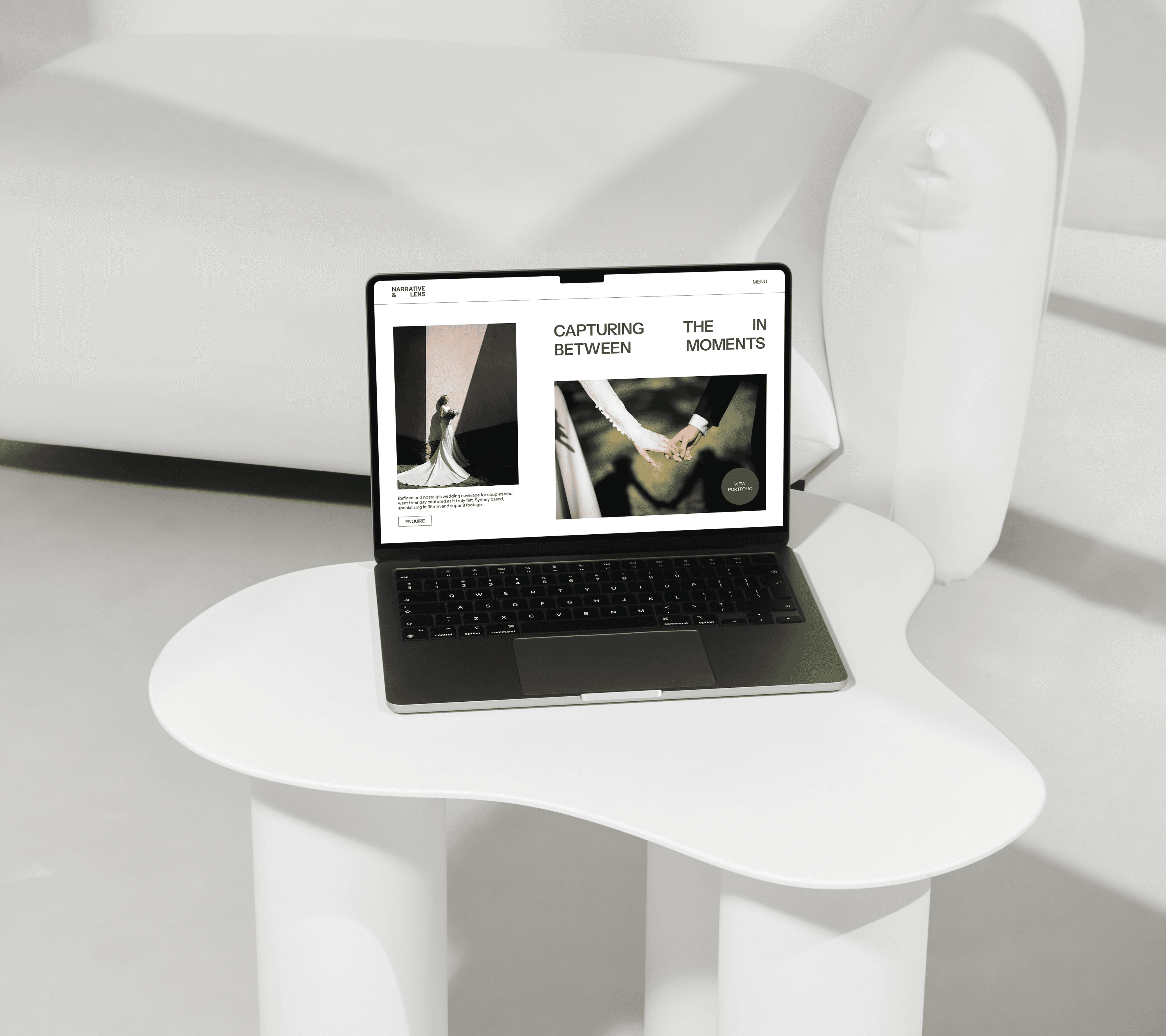
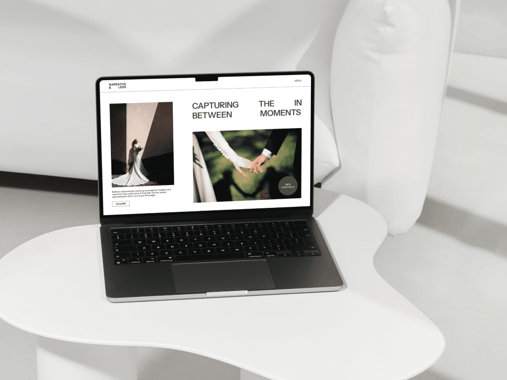
Narrative & Lens partnered with us to refine their brand as they transitioned into a more elevated wedding photography space.
Narrative & Lens partnered with us to refine their brand as they transitioned into a more elevated wedding photography space.
Narrative & Lens partnered with us to refine their brand as they transitioned into a more elevated wedding photography space.
© Narrative & Lens
© Narrative & Lens
© Narrative & Lens
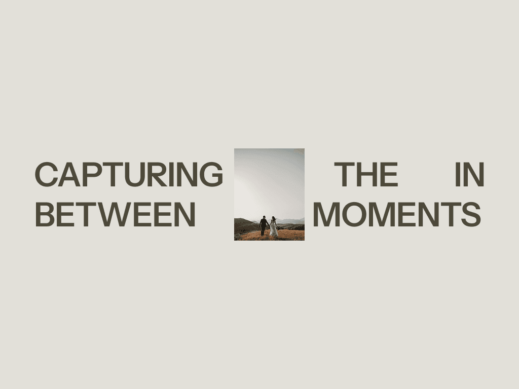


Project Overview
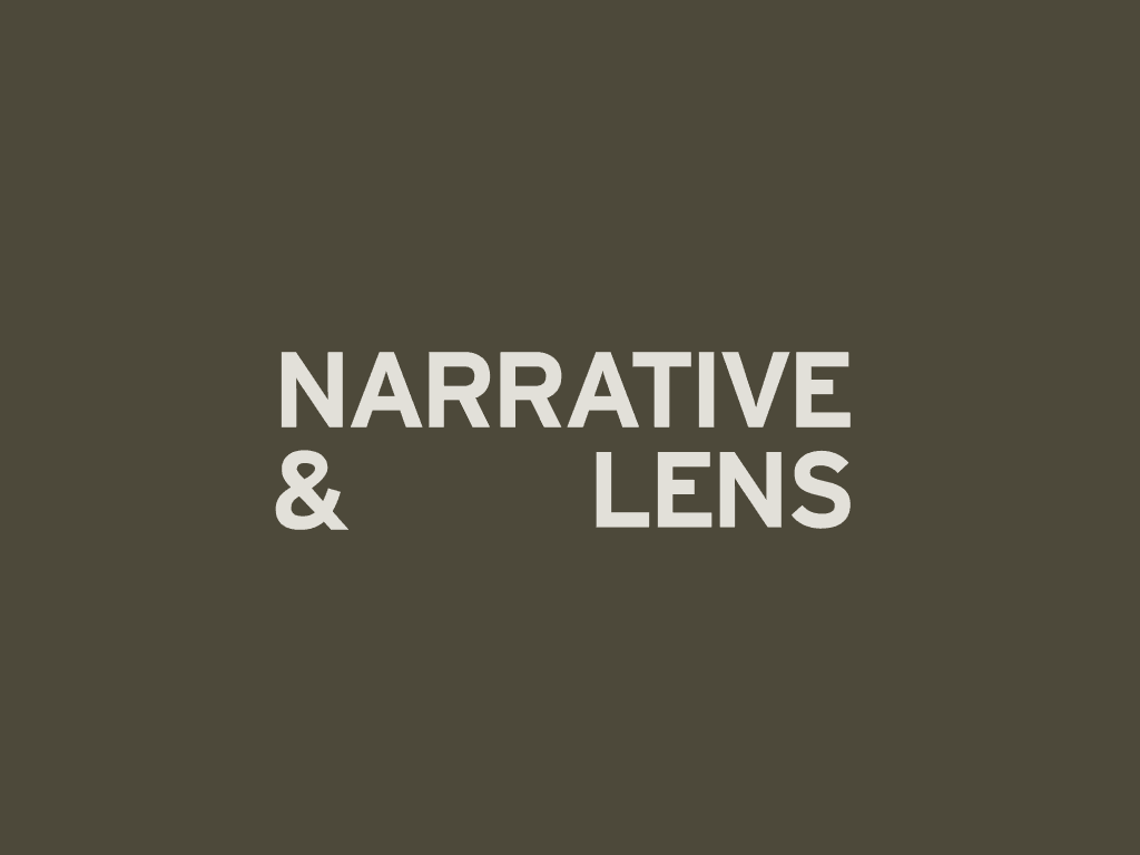
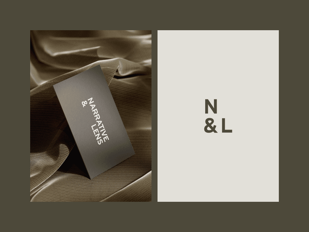
The logo design takes inspiration from classic photojournalism and analogue film title typography, bringing a subtle sense of nostalgia without leaning into anything overly vintage or stylised. This balance reflects Narrative & Lens’ signature blend of modern digital clarity and the organic texture of 35mm film.
The clean, structured arrangement of the typography symbolises the brand’s focus on capturing the quiet, in-between moments, while its thoughtful composition mirrors the ability to blend seamlessly into the flow of the day.
Suite Events
Gold Coast South Rehab
Suite Events
Gold Coast South Rehab
Suite Events
Gold Coast South Rehab